FoodCLUB
FoodCLUB is a UK-based app revolutionising the culinary world by merging AI with everyday cooking. Designed for food content creators, the app reduces cooking fatigue and monetises by offering user subscriptions.
My Role
End-to-end UI/UX designer redesigned the creator feature by optimising the user flow
Date
Nov. 2022- Present
Team
UX/UI design leader Srinivas
Development leader Sam
CEO: Jakub Kreczetowski
User
home cooks, foodies, food influencers, individuals with dietary restrictions, and busy office workers aged 18-35 cater to both men and women.
Project Context
Have you experienced this? Cooking feels messier while filming. Insights from our initial user testing on FoodCLUB's video creation feature led us to develop an iteration that helps chefs focus on cooking, significantly reducing stress during filming.
The Problem
The current user flow requires chefs to frequently interact with the device, which can easily distract them while cooking. This inefficiency could lead to frustration and may prompt users to seek more considerable and effective alternatives.
Business Goal
We aim to streamline the user flow to improve user satisfaction for chefs by 30%. Metrics for success include a 50% reduction in task completion time in our MVP.
Final design& outcome

Key features for seamless create creation
“A quick one-pot meal is not quick when I was videotaping it. To prevent the food from overcooking, I had to give up the editing function!"
Discovery
The rapid design has led to overlooked user needs in some scenarios
The MVP design has been delivered expeditiously to respond to the developers' needs in the fast-paced project. However, feedback from chef friends made me realise that the existing features needed improvement.


“Cooking feels messier because I am looking at the video recording myself at the same time...”
Chefs feedback
Initial Objective Focused on Small User Scope
The initial goal was to provide an efficient tool for sharing quick food snaps, particularly in social scenarios like coffee shops, pubs, and restaurants. To achieve this, we took inspiration from popular social media apps.
Challenge: Resulted in Inevitable Iteration
With just one volunteer backend developer at that time, even a 5-minute video posed significant processing challenges. To quickly complete and launch the MVP, we designed a solution to record and edit videos in small segments, preventing server overload.

User flow of MVP create feature
Usability Test
Video Creation: 60% Abandonment Rate Among Creators
Summary: I conducted a usability test with 5 external users using a moderated qualitative research method to gain insights into users' pain points and deliver action recommendations. you can read the full user testing here.
Insights: Inconvenience of Existing Workflow for Solo or Kitchen Scenarios
-
Solo Creator Scenario
-
No Time to Get in Position: Users find it a bit of a hassle when the video recording kicks off as soon as they tap, leaving no time to get settled in front of the camera.
-
Rear Camera Troubles: Those using the rear camera are in a bit of a pickle because they can’t see when it starts recording, which is a pain if they want top-notch video quality.
-
-
Kitchen Setting Scenario:
-
Workflow issue: In kitchen settings, where hands are often occupied or messy, users need the option to shoot and edit clips seamlessly in one step, avoiding multiple steps.
-

User Testimonials of MVP create feature
Ideation
collaborative ideation helped us move fast
Our ideation session used Miro Board and user testing insights to identify potential solutions to key issues. Through collaborative brainstorming, we developed our final recommendations. Read the full documentation of the session here.

Collaborative Miro space
Final Recommendation
Goal 1: Improve interface usability--consider the cooking scenario
Post-Production Editing: Enable editing of any clip after shooting to offer greater flexibility. At the same time, extend the toolbar to the bottom, making it more prominent and reducing the time users spend selecting and searching for tools.

User flow of V1 create feature
Goal 2: Enhance Usability for Solo Creator Scenarios
Consider integrating features like voice control and delayed starts to accommodate users who need to move away from/ frequently touch the device while cooking.

Voice Control Capers
By pressing the voice control icon and saying "start recording" or "stop recording," users can record hands-free while cooking, avoiding dirtying the screen or the need to wash hands frequently.
Voice Control feature
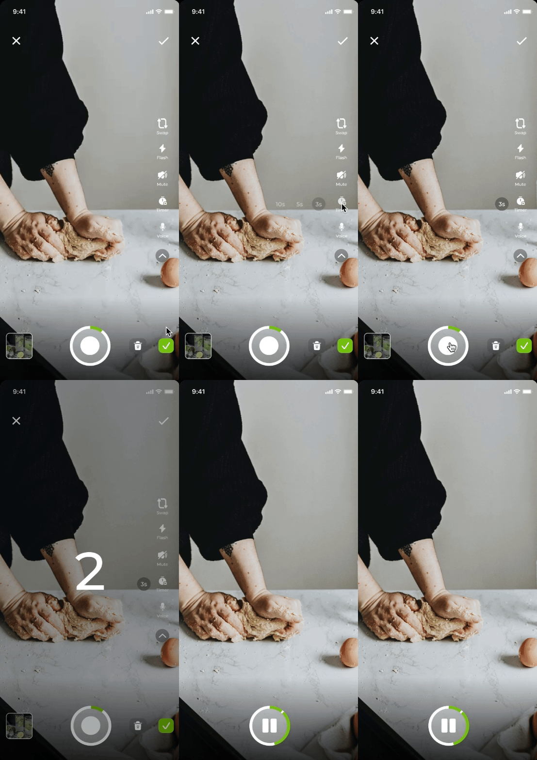
Delayed start
When users activate the delayed start, they can choose a countdown to begin recording. Meanwhile, for those who like to use the rear camera, I've created an optional countdown feature of a flashing light warning.


Delayed start feature and countdown cue
Final design
Takeaway
Reflecting on my time at FoodCLUB I focused mainly on execution, which helped me appreciate the challenge of delivering complete designs to address specific problems. By understanding the company’s strategy and vision, I gained more independence and ownership, especially in conducting user testing.
This experience deepened my understanding of user needs and product strategy. I also realised how important it is to involve developers and stakeholders early on to foster creativity and streamline the process. Moving forward, I aim to seek feedback sooner to avoid rework and enhance my contributions to the team.

